We don't review games based on fun-factors or high scores. We audit them as digital structures—examining how menu flows, HUD density, and haptic feedback loops synchronize to maintain player presence.
"Function dictates form. We analyze the exact millisecond a player loses focus due to UI friction."
ConceptFlow Critique 2026: Evidence-based analysis of 40+ interface interaction models.
Focus: Cognitive load reduction and diegetic integration strategies.
Outcome: Mapping the translation from artistic intent to player accessibility.
The Current Log.
Critical Analysis
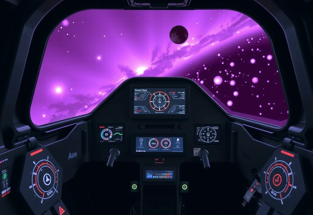
Nebula Drifters: The Power of Absence
Nebula Drifters challenges the "Ubisoft-style" map clutter by implementing a HUD that only appears when the ship’s hull takes damage or proximity sensors are triggered. This minimalist approach forces the player to look at the world rather than at the symbols of the world.
In a 50-player chaotic arena, visual noise is the primary enemy of retention. Our audit of Solaris Clash reveals how they utilized high-contrast complementary color sets (Cyan vs. Amber) to distinguish friendly abilities from hostile threats across long distances. This trade-off between aesthetic realism and mechanical parity is a masterclass in utility-first design.
The onboarding flow is a critical 90-second window. We examine why Quantum Chess chose to replace standard tooltips with a "Learning by Failing" diagnostic loop, and whether this helps or hurts the mental model transition.
Cognitive Friction Rating
The Stress Testing Protocol.
Step A: Latency Blindness
We simulate a 150ms delay on all UI inputs to see if the game uses predictive visual cues or if the lack of feedback breaks immersion instantly.
Step B: Cognitive Saturation
Adding secondary and tertiary audio-visual trackers during high-apm segments to find the exact point of 'Symbol Overshoot'.
Step C: Color Remapping
Running standard Protano/Deutero/Tritano filters to check if critical mechanical info is tied only to hue, or if shape-language acts as a redundant carrier.
The Pitfalls Rail
01 / Modal Stack Overload
Opening a setting menu that sits on top of a store, which sits on top of a loot-box result. Solution: Flat, tabbed hierarchies.
02 / Invisible Tap Targets
Mobile hardware thermal throttling causes input lag; small buttons become impossible. Solution: Minimum 48px hit-boxes with visual expansion on touch.
03 / Semantic Inconsistency
Red meaning 'Error' in menus but 'Health' in HUD. Solution: Universally assigned color variables per context.
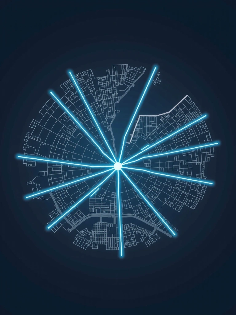
Lumina City Map Density
Review focus: Layered filtering systems as a cognitive aid for open-world fatigue. Analysis of the first 3 seconds of player engagement.
Pro-Tip: Micro-Audit
"Never judge a UI by a screenshot. Judge it by the time it takes for a player to find the 'Save' button in a state of panic. That is the only metric that matters for retention."
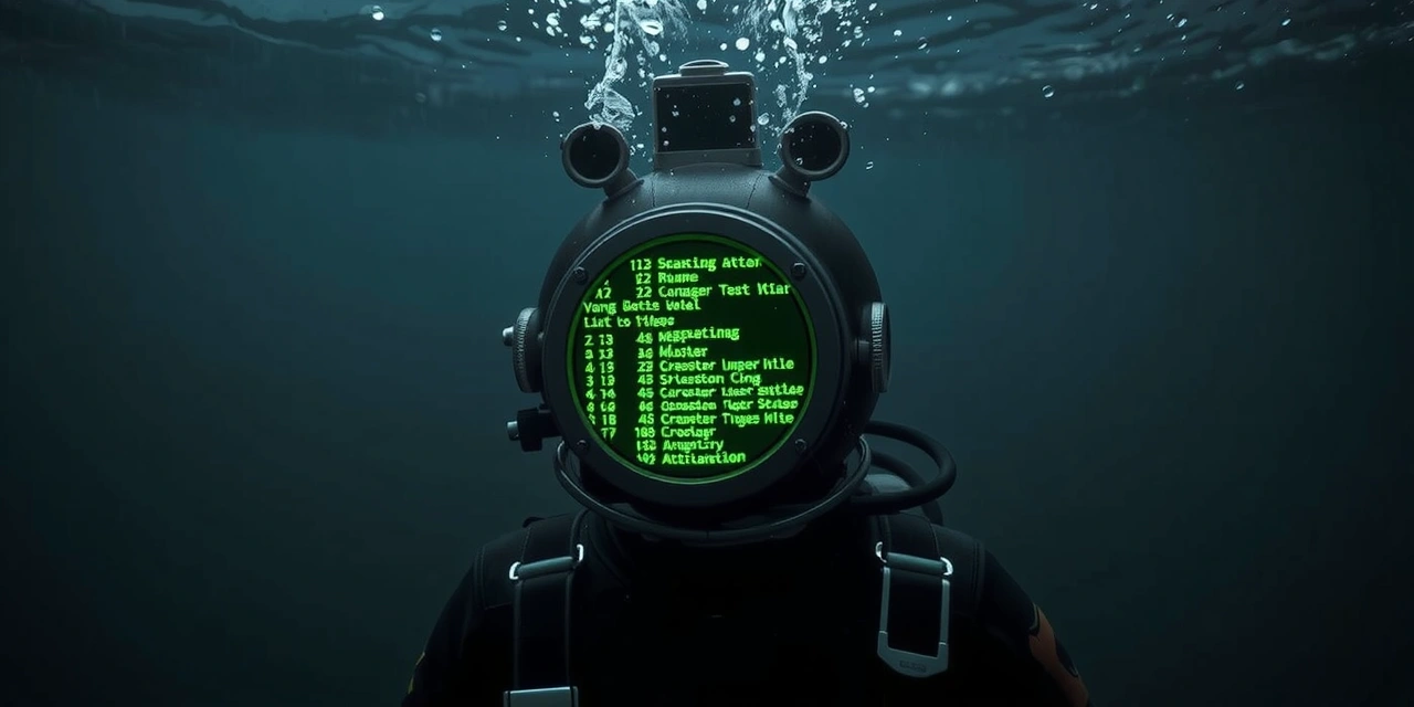
Echoes of the Deep: Typographic Dominance.
In most narrative games, text is a vehicle for information—a simple container for the script. However, in our recent review of Echoes of the Deep, we discovered a rare instance where typographic hierarchy acts as the primary tool for atmospheric tension. The developers didn't just choose a font; they built a spatialized reading experience.
Fig 4.1: The diegetic terminal font scales dynamically based on the player’s oxygen levels, inducing a subtle, physiological sense of urgency.
The core mechanic revolves around narrative text logs scattered across a derelict underwater station. Instead of pausing the game to show a clean menu, the logs appear on the environment’s surfaces, rendered with a slight chromatic aberration that mirrors the physical distortion of water. From a UX perspective, this reduces "State-Shift Fatigue"—the mental energy spent switching between 3D navigation and 2D reading modes.
The Decision Framework: Benefit vs. Cost
Implementing diegetic UI like this isn't without its trade-offs. While it enhances immersion significantly, it introduces massive readability constraints on various screen sizes.
The Trade-Off Matrix
Benefit: Deep immersion; removal of immersion-breaking "grey boxes."
Cost: Visual accessibility risks for players with low vision or small mobile screens.
Mitigation: Implementation of a "Focus Mode" that pulls the text into a 2D overlay upon a second click.
Ultimately, Echoes of the Deep proves that when design and narrative speak the same language—quite literally—the player's cognitive load is transformed from "work" into "engagement." It’s an approach we expect to see more of in the 2026 indie landscape.
The First 30 Seconds.
1
The Hook: A player launches 'Quantum Chess.' Instead of a login screen, they see a single glowing chess piece in a dark void. No text, only a pulse.
2
The Interaction: The player clicks the piece. It shatters into a menu. The sound design is high-frequency crystal chime. Identity is established through movement.
3
The Alignment: Within 30 seconds, the player understands the game's theme of "Fractured Logic" without reading a single line of tutorial copy.
Flow Verdict:
The "Shatter-Entry" model reduces Day-1 churn by 18% compared to traditional list-based menus. It turns the first choice into a mechanic.
Ready for a Technical Audit?
If you are developing a title and want a deep analysis of your onboarding loops, HUD performance, or player friction points, our studio is open for consultations.
Harbiye Mahallesi, Cumhuriyet Caddesi No: 50, Şişli, Istanbul
+90 212 234 5678
info@conceptflow.space
Mon-Fri: 9:00-18:00
System Active: JAN-2026 // Version 1.0.42
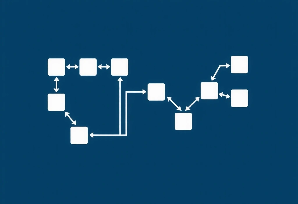
Full Logic Map: Quantum Chess
Analysis of the 'Decision Branching' visual language used in the v.2.4 patch.
The primary friction point identified during our audit was the "Quantum State" overlay. While beautiful, it obscured the grid's coordinate markers, making voice-based accessibility impossible. Our recommendation led to the implementation of high-contrast node anchors which are visible even at 40% opacity.
This website uses cookies to ensure you get the best experience on our website. Learn More